I’m Feeling This Color Psychology Thing
A HOT TOPIC THAT ISN'T THE STORE.
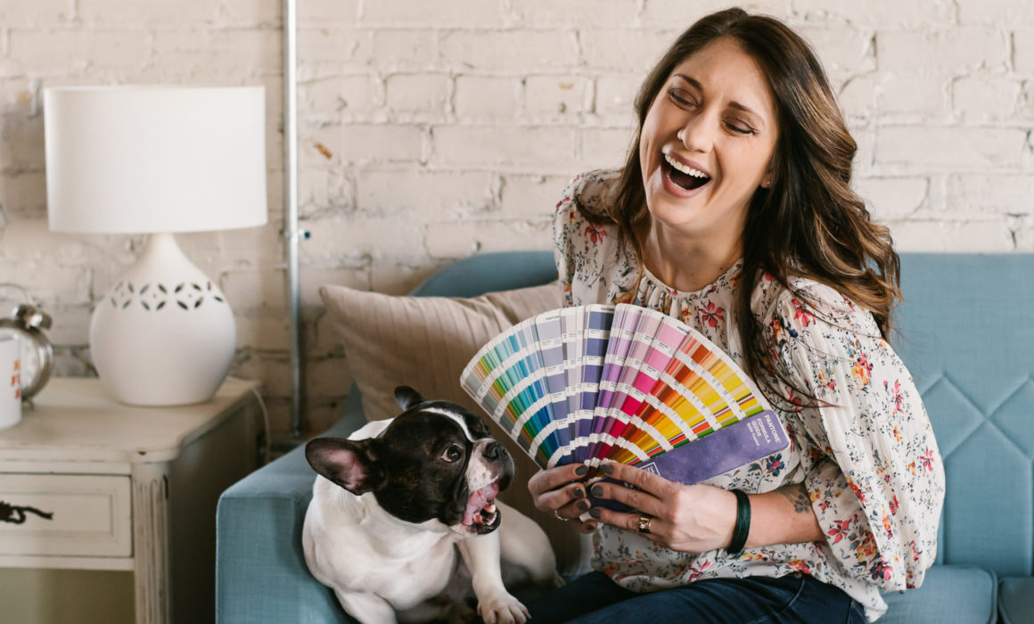
The point is that color makes you feel things, and can be the difference between success and, well, less success, particularly when it comes to the world of branding and creativity. Get this: when choosing a product, 92.6% of people say that they care most about the product’s appearance3. So, yeah, color is important and if you’re trying to jump on the branding craze express and/or are one of those people that chooses wine based off of the pretty label and want to know why, then this blog topic is for YOU.
COLOR HAS POWERS.
Let’s talk about Color Psychology. In short, because human beings rely so heavily on sight, color has the ability to affect our behavior, perception, and mood. As humans, we make judgments about people and things in under 90 seconds and base 62-90% of that assessment on color¹. You might pick one product over another, eat less, pay more attention to a detail, feel happy for no reason, or remember a brand over another (color increases brand recognition by up to 80%²)… the list goes on.
Branding geeks (LunaBird included) use color as a tool to nudge you in the right direction… from six feet away of course. If we’re doing our jobs correctly, you are perceiving a brand exactly how we want you to. This could mean that the color choice makes the brand seem fun, or trustworthy, just plain socially awkward, or whatever you want really. It’s a fancy cocktail/mocktail of feelings that we mixed up for you, and you are definitely subconsciously drinking it (face it, nobody actually drinks Kool-Aid anymore).
White
Technically white has every color inside of it, but you can’t see it. White makes you feel light, fresh, clean, and pure. At least in Western cultures. Did you know that in India, mourners wear white? Yup.
Pink
Red
Energy, power, excitement… let’s say what we’ve all been thinking. This is caffeine in a color. Coca Cola (and Cupid) have quite the monopoly on this one.
Blue
Green
Yellow
Orange
Purple
Brown
Black
Basically, you fancy, or you feel like you are. Black implies culture, class, luxury, and a little bit of rebellion. Those interlocked C’s are for Coco Chanel, baby.
THE MORE YOU KNOW.
Coming at you live from the Rainbow Reading Room… the more you know, right? Branding isn’t just a logo and it isn’t just a “cute” design (btw, we aren’t cute, we’re vicious). Branding is psychology, observation, strategy and so much more and a big part of that is COLOR! Now that you’re hip to branding/color‘s devious ways, what’s next?
At the very least, you now have a good excuse when you buy something you shouldn’t have or when you decide to totally overhaul your branding with LunaBird because we make your little heart soar. Now you can say: the branding made me do it. Want more excuses? Want more witty repartee? Check back soon for other elements to consider when branding/rebranding your company. Knowing me, it’s bound to be a fun time.
Sources.


